DrupalのモジュールViews Bootsrapのブレイクポイントの設定
問題点:Views Bootstrapのブレイクポイント設定が乏しい、Bootstrapの機能を完全活かすことができない
- Drupalのバージョン:7.54
- Views Boostrap:7.x-3.1
- Views Bootstrapの設定画面(Home » Administration » Structure » Views 例:Article)のフォーマットをBootstrap Gridを選択します
- Page Style設定に、グリッドの横/縦と列数の選択しかありません。(ここで仮に:横並び、4列を選択する)
- 設定結果は画面1200以上の場合一行に4個表示されますが、画面1200以下の場合、すぐに一行1個に表示してしまいます(タブレット、スマホの対応ができない)
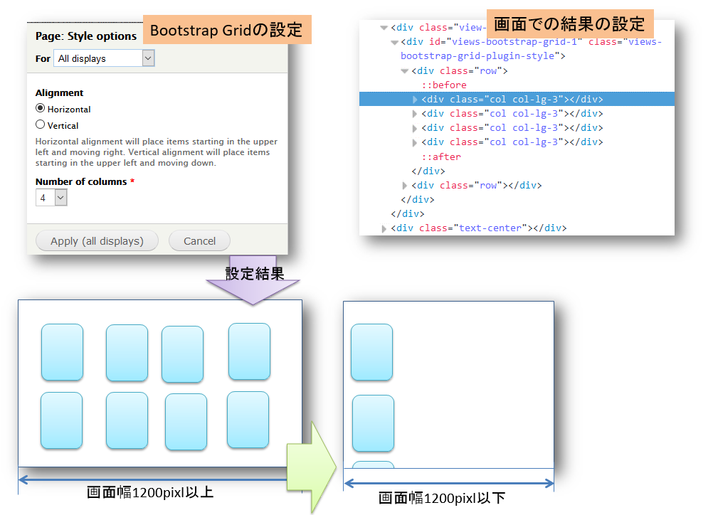
- BootstrapのグリッドシステムがPC、タブレット、スマホのサイズに応じてカラム数(col-md-xx、col-sm-xx、col-xs-xx)を変更するのは本来の機能を活かすことができないです
解決:Javascriptでページロード時にブレイクポイントを設定します
- このような不満がネット上によくありますが、改善はされていないのは現状です
- いろいろパッチもできていますが、将来バージョンアップを考えれば、パッチをなるべく避けたいです
- ここで、javascript(jQuery)でページがロード時に、ブレイクポインを動的に追加します
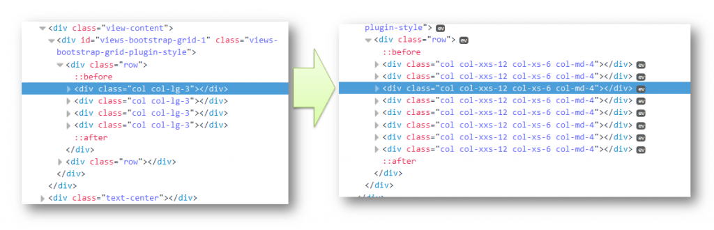
- 例:col-lg-1を削除して、col-md-4,col-xs-6, col-xxs-12などの属性をクラスの追加します
$('.col-lg-1').each( function(){ $(this).addClass( 'col-xxs-12' ); $(this).addClass( 'col-xs-6' ); $(this).addClass( 'col-md-4' ); $(this).removeClass( 'col-lg-1' ); } ); - 実際に変更した結果以下のようとなります:
- ビデオ画像で画面変更でグリッドのブレイクポイントの変化を確認してください
問題点:Bootstrapのブレイクポイントが576px以下のブレイクポイントがない
- 現在、Bootstrap(v4)のグリッドシステムに、画面サイズが576pxのブレイクポイントが一番小さいです

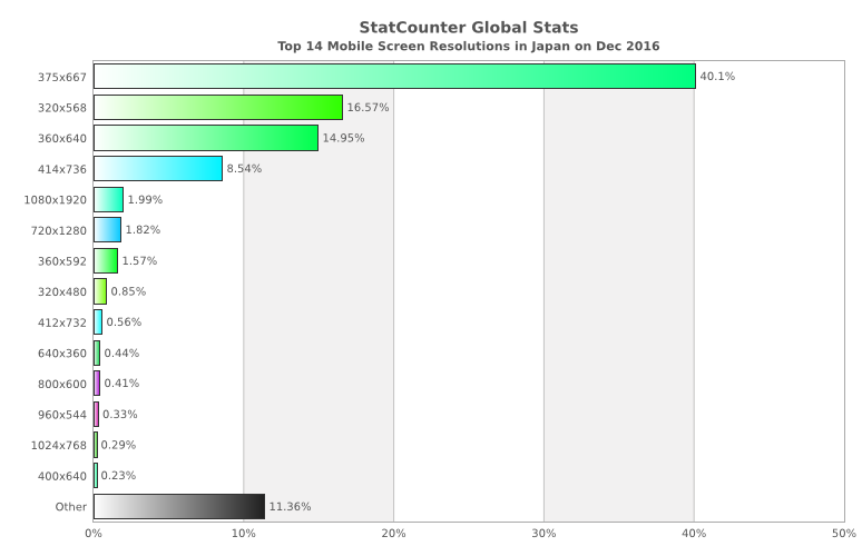
- 実際のスマホサイズとシェアの調査(2017年度)によると約80%のスマホが横幅414px以下となっています
- Bootstrapの最小ブレイクポイント576がちょっと大きいと感じます。実際に画像などの配置にすると410px~480pxぐらいのブレイクポイントが必要となります。
解決:480pxのブレイクポイント(col-xxs-x)をcssファイルに追加
- Bootstrapのブレイクポイント設定を参考しながら、480px(名前:col-xxs-xにする)のブレイクポイント(col-xxs-x)をcssファイルに追加します
/* [+] col-xxs- */
.col-xxs-1, .col-xxs-2, .col-xxs-3, .col-xxs-4, .col-xxs-5, .col-xxs-6, .col-xxs-7, .col-xxs-8, .col-xxs-9, .col-xxs-10, .col-xxs-11, .col-xxs-12 {
    min-height: 1px;
    padding-left: 15px;
    padding-right: 15px;
    position: relative;
}
@media (max-width: 479px) {
    .col-xxs-1, .col-xxs-2, .col-xxs-3, .col-xxs-4, .col-xxs-5, .col-xxs-6, .col-xxs-7, .col-xxs-8, .col-xxs-9, .col-xxs-10, .col-xxs-11, .col-xxs-12 {
        float: left;
    }
    .col-xxs-12 {
        width: 100%;
    }
    .col-xxs-11 {
        width: 91.66666667%;
    }
    .col-xxs-10 {
        width: 83.33333333%;
    }
    .col-xxs-9 {
        width: 75%;
    }
    .col-xxs-8 {
        width: 66.66666667%;
    }
    .col-xxs-7 {
        width: 58.33333333%;
    }
    .col-xxs-6 {
        width: 50%;
    }
    .col-xxs-5 {
        width: 41.66666667%;
    }
    .col-xxs-4 {
        width: 33.33333333%;
    }
    .col-xxs-3 {
        width: 25%;
    }
    .col-xxs-2 {
        width: 16.66666667%;
    }
    .col-xxs-1 {
        width: 8.33333333%;
    }
    .col-xxs-pull-12 {
        right: 100%;
    }
    .col-xxs-pull-11 {
        right: 91.66666667%;
    }
    .col-xxs-pull-10 {
        right: 83.33333333%;
    }
    .col-xxs-pull-9 {
        right: 75%;
    }
    .col-xxs-pull-8 {
        right: 66.66666667%;
    }
    .col-xxs-pull-7 {
        right: 58.33333333%;
    }
    .col-xxs-pull-6 {
        right: 50%;
    }
    .col-xxs-pull-5 {
        right: 41.66666667%;
    }
    .col-xxs-pull-4 {
        right: 33.33333333%;
    }
    .col-xxs-pull-3 {
        right: 25%;
    }
    .col-xxs-pull-2 {
        right: 16.66666667%;
    }
    .col-xxs-pull-1 {
        right: 8.33333333%;
    }
    .col-xxs-pull-0 {
        right: auto;
    }
    .col-xxs-push-12 {
        left: 100%;
    }
    .col-xxs-push-11 {
        left: 91.66666667%;
    }
    .col-xxs-push-10 {
        left: 83.33333333%;
    }
    .col-xxs-push-9 {
        left: 75%;
    }
    .col-xxs-push-8 {
        left: 66.66666667%;
    }
    .col-xxs-push-7 {
        left: 58.33333333%;
    }
    .col-xxs-push-6 {
        left: 50%;
    }
    .col-xxs-push-5 {
        left: 41.66666667%;
    }
    .col-xxs-push-4 {
        left: 33.33333333%;
    }
    .col-xxs-push-3 {
        left: 25%;
    }
    .col-xxs-push-2 {
        left: 16.66666667%;
    }
    .col-xxs-push-1 {
        left: 8.33333333%;
    }
    .col-xxs-push-0 {
        left: auto;
    }
    .col-xxs-offset-12 {
        margin-left: 100%;
    }
    .col-xxs-offset-11 {
        margin-left: 91.66666667%;
    }
    .col-xxs-offset-10 {
        margin-left: 83.33333333%;
    }
    .col-xxs-offset-9 {
        margin-left: 75%;
    }
    .col-xxs-offset-8 {
        margin-left: 66.66666667%;
    }
    .col-xxs-offset-7 {
        margin-left: 58.33333333%;
    }
    .col-xxs-offset-6 {
        margin-left: 50%;
    }
    .col-xxs-offset-5 {
        margin-left: 41.66666667%;
    }
    .col-xxs-offset-4 {
        margin-left: 33.33333333%;
    }
    .col-xxs-offset-3 {
        margin-left: 25%;
    }
    .col-xxs-offset-2 {
        margin-left: 16.66666667%;
    }
    .col-xxs-offset-1 {
        margin-left: 8.33333333%;
    }
    .col-xxs-offset-0 {
        margin-left: 0;
    }
}
/* [+] hidden-xxs */
@media (max-width: 479px) {
    .hidden-xxs {
        display: none !important;
    }
}
/* [+] visible-xxs and visible-xxs- */
.visible-xxs {
    display: none !important;
}
.visible-xxs-block,
.visible-xxs-inline,
.visible-xxs-inline-block {
    display: none !important;
}
@media (max-width: 479px) {
    .visible-xxs {
        display: block !important;
    }
    table.visible-xxs {
        display: table;
    }
    tr.visible-xxs {
        display: table-row !important;
    }
    th.visible-xxs,
    td.visible-xxs {
        display: table-cell !important;
    }
    .visible-xxs-block {
        display: block !important;
    }
    .visible-xxs-inline {
        display: inline !important;
    }
    .visible-xxs-inline-block {
        display: inline-block !important;
    }
}
問題点:Views Bootstrapのブレイクポイント設定が乏しい、Bootstrapの機能を完全活かすことができない
- Drupalのバージョン:7.54
- Views Boostrap:7.x-3.1
- Views Bootstrapの設定画面(Home » Administration » Structure » Views 例:Article)のフォーマットをBootstrap Gridを選択します
- Page Style設定に、グリッドの横/縦と列数の選択しかありません。(ここで仮に:横並び、4列を選択する)
- 設定結果は画面1200以上の場合一行に4個表示されますが、画面1200以下の場合、すぐに一行1個に表示してしまいます(タブレット、スマホの対応ができない)
- BootstrapのグリッドシステムがPC、タブレット、スマホのサイズに応じてカラム数(col-md-xx、col-sm-xx、col-xs-xx)を変更するのは本来の機能を活かすことができないです
解決:Javascriptでページロード時にブレイクポイントを設定します
- このような不満がネット上によくありますが、改善はされていないのは現状です
- いろいろパッチもできていますが、将来バージョンアップを考えれば、パッチをなるべく避けたいです
- ここで、javascript(jQuery)でページがロード時に、ブレイクポインを動的に追加します
- 例:col-lg-1を削除して、col-md-4,col-xs-6, col-xxs-12などの属性をクラスの追加します
$('.col-lg-1').each( function(){ $(this).addClass( 'col-xxs-12' ); $(this).addClass( 'col-xs-6' ); $(this).addClass( 'col-md-4' ); $(this).removeClass( 'col-lg-1' ); } ); - 実際に変更した結果以下のようとなります:
- ビデオ画像で画面変更でグリッドのブレイクポイントの変化を確認してください
問題点:Bootstrapのブレイクポイントが576px以下のブレイクポイントがない
- 現在、Bootstrap(v4)のグリッドシステムに、画面サイズが576pxのブレイクポイントが一番小さいです
- 実際のスマホサイズとシェアの調査(2017年度)によると約80%のスマホが横幅414px以下となっています
- Bootstrapの最小ブレイクポイント576がちょっと大きいと感じます。実際に画像などの配置にすると410px~480pxぐらいのブレイクポイントが必要となります。
解決:480pxのブレイクポイント(col-xxs-x)をcssファイルに追加
- Bootstrapのブレイクポイント設定を参考しながら、480px(名前:col-xxs-xにする)のブレイクポイント(col-xxs-x)をcssファイルに追加します
/* [+] col-xxs- */
.col-xxs-1, .col-xxs-2, .col-xxs-3, .col-xxs-4, .col-xxs-5, .col-xxs-6, .col-xxs-7, .col-xxs-8, .col-xxs-9, .col-xxs-10, .col-xxs-11, .col-xxs-12 {
    min-height: 1px;
    padding-left: 15px;
    padding-right: 15px;
    position: relative;
}
@media (max-width: 479px) {
    .col-xxs-1, .col-xxs-2, .col-xxs-3, .col-xxs-4, .col-xxs-5, .col-xxs-6, .col-xxs-7, .col-xxs-8, .col-xxs-9, .col-xxs-10, .col-xxs-11, .col-xxs-12 {
        float: left;
    }
    .col-xxs-12 {
        width: 100%;
    }
    .col-xxs-11 {
        width: 91.66666667%;
    }
    .col-xxs-10 {
        width: 83.33333333%;
    }
    .col-xxs-9 {
        width: 75%;
    }
    .col-xxs-8 {
        width: 66.66666667%;
    }
    .col-xxs-7 {
        width: 58.33333333%;
    }
    .col-xxs-6 {
        width: 50%;
    }
    .col-xxs-5 {
        width: 41.66666667%;
    }
    .col-xxs-4 {
        width: 33.33333333%;
    }
    .col-xxs-3 {
        width: 25%;
    }
    .col-xxs-2 {
        width: 16.66666667%;
    }
    .col-xxs-1 {
        width: 8.33333333%;
    }
    .col-xxs-pull-12 {
        right: 100%;
    }
    .col-xxs-pull-11 {
        right: 91.66666667%;
    }
    .col-xxs-pull-10 {
        right: 83.33333333%;
    }
    .col-xxs-pull-9 {
        right: 75%;
    }
    .col-xxs-pull-8 {
        right: 66.66666667%;
    }
    .col-xxs-pull-7 {
        right: 58.33333333%;
    }
    .col-xxs-pull-6 {
        right: 50%;
    }
    .col-xxs-pull-5 {
        right: 41.66666667%;
    }
    .col-xxs-pull-4 {
        right: 33.33333333%;
    }
    .col-xxs-pull-3 {
        right: 25%;
    }
    .col-xxs-pull-2 {
        right: 16.66666667%;
    }
    .col-xxs-pull-1 {
        right: 8.33333333%;
    }
    .col-xxs-pull-0 {
        right: auto;
    }
    .col-xxs-push-12 {
        left: 100%;
    }
    .col-xxs-push-11 {
        left: 91.66666667%;
    }
    .col-xxs-push-10 {
        left: 83.33333333%;
    }
    .col-xxs-push-9 {
        left: 75%;
    }
    .col-xxs-push-8 {
        left: 66.66666667%;
    }
    .col-xxs-push-7 {
        left: 58.33333333%;
    }
    .col-xxs-push-6 {
        left: 50%;
    }
    .col-xxs-push-5 {
        left: 41.66666667%;
    }
    .col-xxs-push-4 {
        left: 33.33333333%;
    }
    .col-xxs-push-3 {
        left: 25%;
    }
    .col-xxs-push-2 {
        left: 16.66666667%;
    }
    .col-xxs-push-1 {
        left: 8.33333333%;
    }
    .col-xxs-push-0 {
        left: auto;
    }
    .col-xxs-offset-12 {
        margin-left: 100%;
    }
    .col-xxs-offset-11 {
        margin-left: 91.66666667%;
    }
    .col-xxs-offset-10 {
        margin-left: 83.33333333%;
    }
    .col-xxs-offset-9 {
        margin-left: 75%;
    }
    .col-xxs-offset-8 {
        margin-left: 66.66666667%;
    }
    .col-xxs-offset-7 {
        margin-left: 58.33333333%;
    }
    .col-xxs-offset-6 {
        margin-left: 50%;
    }
    .col-xxs-offset-5 {
        margin-left: 41.66666667%;
    }
    .col-xxs-offset-4 {
        margin-left: 33.33333333%;
    }
    .col-xxs-offset-3 {
        margin-left: 25%;
    }
    .col-xxs-offset-2 {
        margin-left: 16.66666667%;
    }
    .col-xxs-offset-1 {
        margin-left: 8.33333333%;
    }
    .col-xxs-offset-0 {
        margin-left: 0;
    }
}
/* [+] hidden-xxs */
@media (max-width: 479px) {
    .hidden-xxs {
        display: none !important;
    }
}
/* [+] visible-xxs and visible-xxs- */
.visible-xxs {
    display: none !important;
}
.visible-xxs-block,
.visible-xxs-inline,
.visible-xxs-inline-block {
    display: none !important;
}
@media (max-width: 479px) {
    .visible-xxs {
        display: block !important;
    }
    table.visible-xxs {
        display: table;
    }
    tr.visible-xxs {
        display: table-row !important;
    }
    th.visible-xxs,
    td.visible-xxs {
        display: table-cell !important;
    }
    .visible-xxs-block {
        display: block !important;
    }
    .visible-xxs-inline {
        display: inline !important;
    }
    .visible-xxs-inline-block {
        display: inline-block !important;
    }
}
問題点:Views Bootstrapのブレイクポイント設定が乏しい、Bootstrapの機能を完全活かすことができない
- Drupalのバージョン:7.54
- Views Boostrap:7.x-3.1
- Views Bootstrapの設定画面(Home » Administration » Structure » Views 例:Article)のフォーマットをBootstrap Gridを選択します
- Page Style設定に、グリッドの横/縦と列数の選択しかありません。(ここで仮に:横並び、4列を選択する)
- 設定結果は画面1200以上の場合一行に4個表示されますが、画面1200以下の場合、すぐに一行1個に表示してしまいます(タブレット、スマホの対応ができない)
- BootstrapのグリッドシステムがPC、タブレット、スマホのサイズに応じてカラム数(col-md-xx、col-sm-xx、col-xs-xx)を変更するのは本来の機能を活かすことができないです
解決:Javascriptでページロード時にブレイクポイントを設定します
- このような不満がネット上によくありますが、改善はされていないのは現状です
- いろいろパッチもできていますが、将来バージョンアップを考えれば、パッチをなるべく避けたいです
- ここで、javascript(jQuery)でページがロード時に、ブレイクポインを動的に追加します
- 例:col-lg-1を削除して、col-md-4,col-xs-6, col-xxs-12などの属性をクラスの追加します
$('.col-lg-1').each( function(){ $(this).addClass( 'col-xxs-12' ); $(this).addClass( 'col-xs-6' ); $(this).addClass( 'col-md-4' ); $(this).removeClass( 'col-lg-1' ); } ); - 実際に変更した結果以下のようとなります:
- ビデオ画像で画面変更でグリッドのブレイクポイントの変化を確認してください
