SVG+CSS+JSで時間表示/動画パイタイマーの作成方法2:タイマー点滅効果の追加
やりたいこと:タイマー(時間)を点滅できるように表示したいです
- タイマーの作成:SVG+CSS+JSで時間表示/動画パイタイマーの作成方法
- 前回紹介したタイマーの改善点:タイマー(時間)を一秒ごと点滅にして表示したほうがより見やすくなります
- タイマーが点滅しなくても、機能には問題はありません
- 表示上には少し硬い感じがあります
JSの関数(setInterval(で、))内タイマーを点滅させるcssプロパティ(animation)を追加します
- css で文字点滅プロパティ(animation, keyframes)を利用します
/* CSS のプロパティ:animationの定義 */ .shine{ animation: letter-shine 1s ; } /* CSS で点滅効果の作成 */ @keyframes letter-shine{ 0% { opacity: 0 ; } 50% { opacity: 1 ; transform: scale(1.1); } 100% { opacity: 0 ; } } - JSの関数(setInterval())内で、一秒ごとでタイマー顛末効果を追加します
/* 一秒ごとでタイマー(shine)の点滅cssを動的に追加 */ var count=0; timer=setInterval(function(){ count ++ ; $(".shine").text(count); $(".shine").css("animation","lettle-shine-even 1s"); }, 1000 ); - うまくいくはずと予測しましたが、最初の一回目だけ点滅して、二回目以降は点滅しなくなります
問題点:JSで同じcssプロパティ(animation)を追加したときにうまく動作しません
- 上記の追加方法では二回目以降はanimation効果はなくなります
- 原因は思いつきませんでした
解決1:CSSプロパティ(animation)の値(infinite)を追加
- cssプロパティ(animation)がその動作を繰り返す値(infinite)を追加すれば点滅が続きます
/* animationの値(infinite)でタイマーを点滅させる */ var count=0; timer=setInterval(function(){ count ++ ; $(".shine").text(count); $(".shine").css("animation","lettle-shine-even 1s infinite"); }, 1000 ); - この場合、JSの関数(setInterval())内で設定する必要はないです(cssで一回設定すればよいです)
- 問題点は、点滅開始のタイミング、タイマー中止、再開などの操作時に点滅タイミングは合わないです
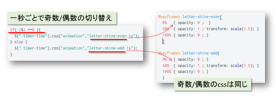
解決2:二つ同じanimationのcss設定(@keyframes)を交代で設定します
- 二つ同じ点滅させるcss設定(@keyframes)を一秒ごとで交代に表示させればよいです
// JSのロジック count=0; timer=setInterval(function(){ count ++ ; $(".shine").text(count); $(".shine").removeAttr("style"); if( count%2 ==0 ){ $(".shine").css("animation","letter-shine-even 1s"); } else { $(".shine").css("animation","letter-shine-odd 1s"); } }, 1000 ); /* cssのanimationの値:@keyframes */ @keyframes letter-shine-even{ 0% { opacity: 0 ; } 50% { opacity: 1 ; transform: scale(1.1); } 100% { opacity: 0 ; } } @keyframes letter-shine-odd{ 0% { opacity: 0 ; } 50% { opacity: 1 ; transform: scale(1.1); } 100% { opacity: 0 ; } } - このような書き方では、タイマー点滅の同期管理が簡単になります
- 実際の点滅動画効果は以下のとなります
やりたいこと:残留時間が表示しながら円を描く動画効果のタイマーを作成します
- 残量時間を動画で表示します
- 残量時間のパイを動画で表示します
SVG+CSS+JSでタイマーの動画効果を作成します
- svg、css、js三兄弟でパイタイマーを実現します
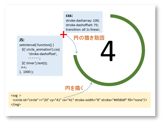
- HTMLでタイマーを描く場所の用意
<div class="item"> <div class="timer-time">10</div> <svg width="160" height="160" xmlns="http://www.w3.org/2000/svg"> <g> <title>Pie Timer</title> <circle id="circle" class="timer-circle" r="40" cy="81" cx="81" stroke-width="8" stroke="#6fdb6f" fill="none"/> </g> </svg> </div> - svgの「circle」タグで円を描きます
<svg width="80" height="80" xmlns="http://www.w3.org/2000/svg">
 <g>
  <title>Pie Timer</title>
  <circle id="circle" class="timer-circle" r="40" cy="81" cx="81" stroke-width="8" stroke="#6fdb6f" fill="none"/>
 </g>
</svg>
- cssで残量時間と円の中心に合わせ、パイ動画の用意
/* タイマーの表示場所指定 */ .item { position: relative; float: left; } /* 残量時間を円の中心に合わせ */ .timer-time { text-align:center; position: absolute; line-height: 4em; width: 100%; font-size:2.5em; } /* 真上から円を描く指定 */ svg { -webkit-transform: rotate(-90deg); transform: rotate(-90deg); } /* 円を描く動画の準備 */ .timer-circle { stroke-dasharray: 280; stroke-dashoffset: 280; transition: all 1s linear; }- 円を描く準備: stroke-dasharray: 280; stroke-dashoffset: 280; はSVG動画作成によく利用される手法です。簡単に言えば、画像を隠して、JSのタイマーより画像を描きます。
- transition: all 1s linear; 動画をスムーズに描けるように設定
- JSのタイマーより残量時間のセット、タイマーパイを描きます
var time = 10;
var initialOffset = '280';
var i = 1
var interval = setInterval(function() {
    $('.timer-circle').css('stroke-dashoffset', initialOffset-(i*(initialOffset/time)));
    $('.timer-time').text(10-i);
    if (i == time) { clearInterval(interval); } // 連続の場合: i=1;
    i++;
}, 1000);
感想:SVGを利用したほうがCSS+JSのみの方式より簡単で、シンプルです
- SVGが画像を描くには得意です。
- SVGがCSS、JSと一緒に使用すればよい効果的な動画作成ができます
- CSS、JSのみでパイタイマーの作成がネット上でよく紹介されていますが、cssの設定に気を付けないと、動画の動きがスムーズになれないことがあります。この点ではSVGのほうが扱いやすいです
やりたいこと:タイマー(時間)を点滅できるように表示したいです
- タイマーの作成:SVG+CSS+JSで時間表示/動画パイタイマーの作成方法
- 前回紹介したタイマーの改善点:タイマー(時間)を一秒ごと点滅にして表示したほうがより見やすくなります
- タイマーが点滅しなくても、機能には問題はありません
- 表示上には少し硬い感じがあります
JSの関数(setInterval(で、))内タイマーを点滅させるcssプロパティ(animation)を追加します
- css で文字点滅プロパティ(animation, keyframes)を利用します
/* CSS のプロパティ:animationの定義 */ .shine{ animation: letter-shine 1s ; } /* CSS で点滅効果の作成 */ @keyframes letter-shine{ 0% { opacity: 0 ; } 50% { opacity: 1 ; transform: scale(1.1); } 100% { opacity: 0 ; } } - JSの関数(setInterval())内で、一秒ごとでタイマー顛末効果を追加します
/* 一秒ごとでタイマー(shine)の点滅cssを動的に追加 */ var count=0; timer=setInterval(function(){ count ++ ; $(".shine").text(count); $(".shine").css("animation","lettle-shine-even 1s"); }, 1000 ); - うまくいくはずと予測しましたが、最初の一回目だけ点滅して、二回目以降は点滅しなくなります
問題点:JSで同じcssプロパティ(animation)を追加したときにうまく動作しません
- 上記の追加方法では二回目以降はanimation効果はなくなります
- 原因は思いつきませんでした
解決1:CSSプロパティ(animation)の値(infinite)を追加
- cssプロパティ(animation)がその動作を繰り返す値(infinite)を追加すれば点滅が続きます
/* animationの値(infinite)でタイマーを点滅させる */ var count=0; timer=setInterval(function(){ count ++ ; $(".shine").text(count); $(".shine").css("animation","lettle-shine-even 1s infinite"); }, 1000 ); - この場合、JSの関数(setInterval())内で設定する必要はないです(cssで一回設定すればよいです)
- 問題点は、点滅開始のタイミング、タイマー中止、再開などの操作時に点滅タイミングは合わないです
解決2:二つ同じanimationのcss設定(@keyframes)を交代で設定します
- 二つ同じ点滅させるcss設定(@keyframes)を一秒ごとで交代に表示させればよいです
// JSのロジック count=0; timer=setInterval(function(){ count ++ ; $(".shine").text(count); $(".shine").removeAttr("style"); if( count%2 ==0 ){ $(".shine").css("animation","letter-shine-even 1s"); } else { $(".shine").css("animation","letter-shine-odd 1s"); } }, 1000 ); /* cssのanimationの値:@keyframes */ @keyframes letter-shine-even{ 0% { opacity: 0 ; } 50% { opacity: 1 ; transform: scale(1.1); } 100% { opacity: 0 ; } } @keyframes letter-shine-odd{ 0% { opacity: 0 ; } 50% { opacity: 1 ; transform: scale(1.1); } 100% { opacity: 0 ; } } - このような書き方では、タイマー点滅の同期管理が簡単になります
- 実際の点滅動画効果は以下のとなります
やりたいこと:残留時間が表示しながら円を描く動画効果のタイマーを作成します
- 残量時間を動画で表示します
- 残量時間のパイを動画で表示します
SVG+CSS+JSでタイマーの動画効果を作成します
- svg、css、js三兄弟でパイタイマーを実現します
- HTMLでタイマーを描く場所の用意
<div class="item"> <div class="timer-time">10</div> <svg width="160" height="160" xmlns="http://www.w3.org/2000/svg"> <g> <title>Pie Timer</title> <circle id="circle" class="timer-circle" r="40" cy="81" cx="81" stroke-width="8" stroke="#6fdb6f" fill="none"/> </g> </svg> </div> - svgの「circle」タグで円を描きます
<svg width="80" height="80" xmlns="http://www.w3.org/2000/svg">
 <g>
  <title>Pie Timer</title>
  <circle id="circle" class="timer-circle" r="40" cy="81" cx="81" stroke-width="8" stroke="#6fdb6f" fill="none"/>
 </g>
</svg>
- cssで残量時間と円の中心に合わせ、パイ動画の用意
/* タイマーの表示場所指定 */ .item { position: relative; float: left; } /* 残量時間を円の中心に合わせ */ .timer-time { text-align:center; position: absolute; line-height: 4em; width: 100%; font-size:2.5em; } /* 真上から円を描く指定 */ svg { -webkit-transform: rotate(-90deg); transform: rotate(-90deg); } /* 円を描く動画の準備 */ .timer-circle { stroke-dasharray: 280; stroke-dashoffset: 280; transition: all 1s linear; }- 円を描く準備: stroke-dasharray: 280; stroke-dashoffset: 280; はSVG動画作成によく利用される手法です。簡単に言えば、画像を隠して、JSのタイマーより画像を描きます。
- transition: all 1s linear; 動画をスムーズに描けるように設定
- JSのタイマーより残量時間のセット、タイマーパイを描きます
var time = 10;
var initialOffset = '280';
var i = 1
var interval = setInterval(function() {
    $('.timer-circle').css('stroke-dashoffset', initialOffset-(i*(initialOffset/time)));
    $('.timer-time').text(10-i);
    if (i == time) { clearInterval(interval); } // 連続の場合: i=1;
    i++;
}, 1000);
感想:SVGを利用したほうがCSS+JSのみの方式より簡単で、シンプルです
- SVGが画像を描くには得意です。
- SVGがCSS、JSと一緒に使用すればよい効果的な動画作成ができます
- CSS、JSのみでパイタイマーの作成がネット上でよく紹介されていますが、cssの設定に気を付けないと、動画の動きがスムーズになれないことがあります。この点ではSVGのほうが扱いやすいです
やりたいこと:タイマー(時間)を点滅できるように表示したいです
- タイマーの作成:SVG+CSS+JSで時間表示/動画パイタイマーの作成方法
- 前回紹介したタイマーの改善点:タイマー(時間)を一秒ごと点滅にして表示したほうがより見やすくなります
- タイマーが点滅しなくても、機能には問題はありません
- 表示上には少し硬い感じがあります
JSの関数(setInterval(で、))内タイマーを点滅させるcssプロパティ(animation)を追加します
- css で文字点滅プロパティ(animation, keyframes)を利用します
/* CSS のプロパティ:animationの定義 */ .shine{ animation: letter-shine 1s ; } /* CSS で点滅効果の作成 */ @keyframes letter-shine{ 0% { opacity: 0 ; } 50% { opacity: 1 ; transform: scale(1.1); } 100% { opacity: 0 ; } } - JSの関数(setInterval())内で、一秒ごとでタイマー顛末効果を追加します
/* 一秒ごとでタイマー(shine)の点滅cssを動的に追加 */ var count=0; timer=setInterval(function(){ count ++ ; $(".shine").text(count); $(".shine").css("animation","lettle-shine-even 1s"); }, 1000 ); - うまくいくはずと予測しましたが、最初の一回目だけ点滅して、二回目以降は点滅しなくなります
問題点:JSで同じcssプロパティ(animation)を追加したときにうまく動作しません
- 上記の追加方法では二回目以降はanimation効果はなくなります
- 原因は思いつきませんでした
解決1:CSSプロパティ(animation)の値(infinite)を追加
- cssプロパティ(animation)がその動作を繰り返す値(infinite)を追加すれば点滅が続きます
/* animationの値(infinite)でタイマーを点滅させる */ var count=0; timer=setInterval(function(){ count ++ ; $(".shine").text(count); $(".shine").css("animation","lettle-shine-even 1s infinite"); }, 1000 ); - この場合、JSの関数(setInterval())内で設定する必要はないです(cssで一回設定すればよいです)
- 問題点は、点滅開始のタイミング、タイマー中止、再開などの操作時に点滅タイミングは合わないです
解決2:二つ同じanimationのcss設定(@keyframes)を交代で設定します
- 二つ同じ点滅させるcss設定(@keyframes)を一秒ごとで交代に表示させればよいです
// JSのロジック count=0; timer=setInterval(function(){ count ++ ; $(".shine").text(count); $(".shine").removeAttr("style"); if( count%2 ==0 ){ $(".shine").css("animation","letter-shine-even 1s"); } else { $(".shine").css("animation","letter-shine-odd 1s"); } }, 1000 ); /* cssのanimationの値:@keyframes */ @keyframes letter-shine-even{ 0% { opacity: 0 ; } 50% { opacity: 1 ; transform: scale(1.1); } 100% { opacity: 0 ; } } @keyframes letter-shine-odd{ 0% { opacity: 0 ; } 50% { opacity: 1 ; transform: scale(1.1); } 100% { opacity: 0 ; } } - このような書き方では、タイマー点滅の同期管理が簡単になります
- 実際の点滅動画効果は以下のとなります
